User Feedback
User Feedback
Section titled “User Feedback”1. Overview
Section titled “1. Overview”To ensure continuous improvement and a user-centered design, we implemented a formal user feedback process starting in Sprint 2.
The goal was to validate usability, design, and feature functionality by collecting insights from early testers (friends, classmates, and family members).
2. Feedback Collection Process
Section titled “2. Feedback Collection Process”- Tool Used: Google Forms
- Distribution: Shared via WhatsApp groups, with family members , friends and with other testers
- Response Window: Open since Sprint 2 and extended into Sprint 3.
- Sample Size: Over 20+ respondents.
- Data Export: Responses exported to Google Sheets for structured analysis.
📄 Resources:
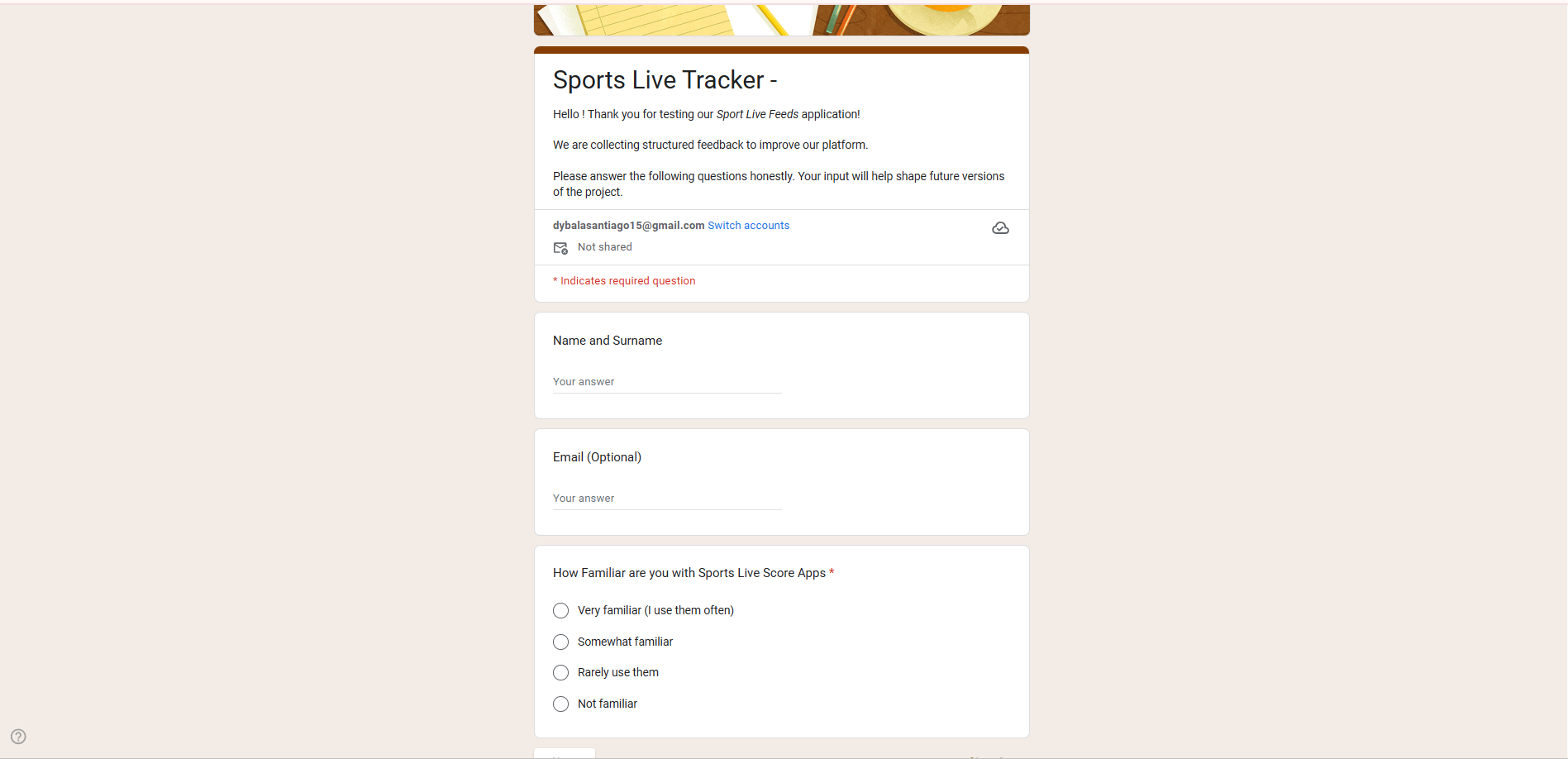
3. Form Structure & Screenshots
Section titled “3. Form Structure & Screenshots”Section 1: User Info
Questions:
- Name and Surname
- Email (Optional)
- How familiar are you with Sports Live Score Apps?
- Very familiar (I use them often)
- Somewhat familiar
- Rarely use them
- Not familiar
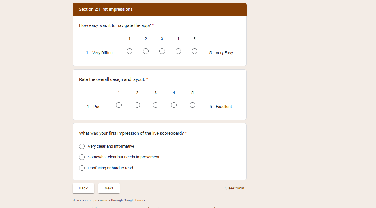
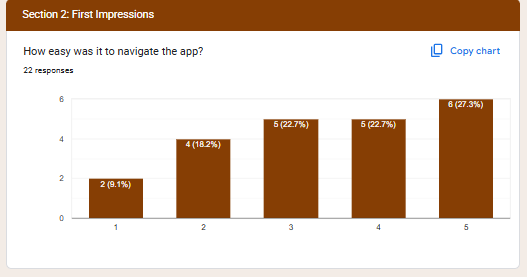
Section 2: First Impressions
Questions:
- How easy was it to navigate the app? (1 = Very Difficult, 5 = Very Easy)
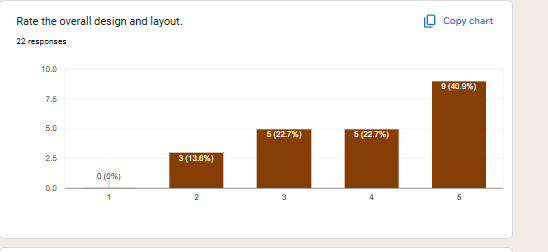
- Rate the overall design and layout (1 = Poor, 5 = Excellent)
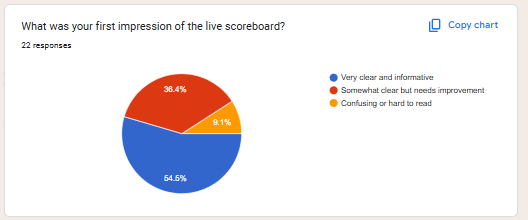
- What was your first impression of the live scoreboard?
- Very clear and informative
- Somewhat clear but needs improvement
- Confusing or hard to read
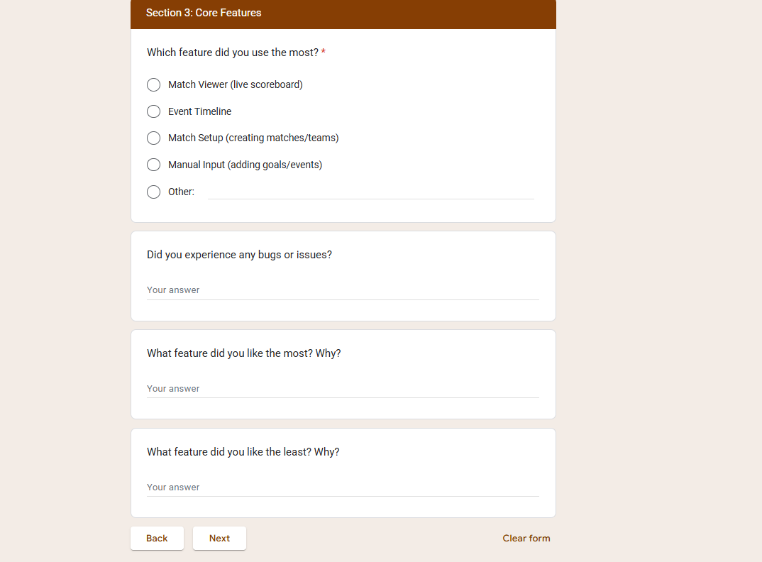
Section 3: Core Features
Questions:
-
Which feature did you use the most?
- Match Viewer (live scoreboard)
- Event Timeline
- Match Setup (creating matches/teams)
- Manual Input (adding goals/events)
- Other
-
Did you experience any bugs or issues?
-
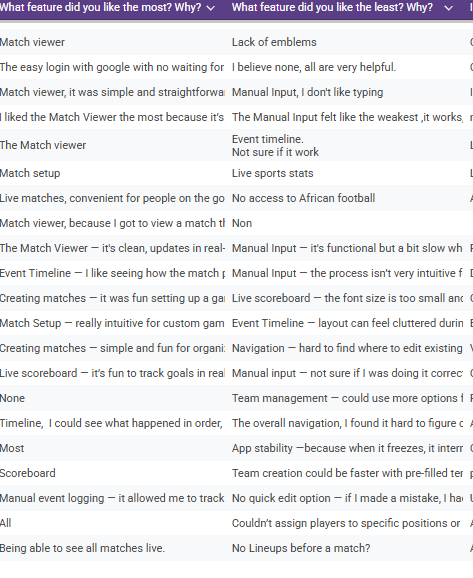
What feature did you like the most? Why?
-
What feature did you like the least? Why?
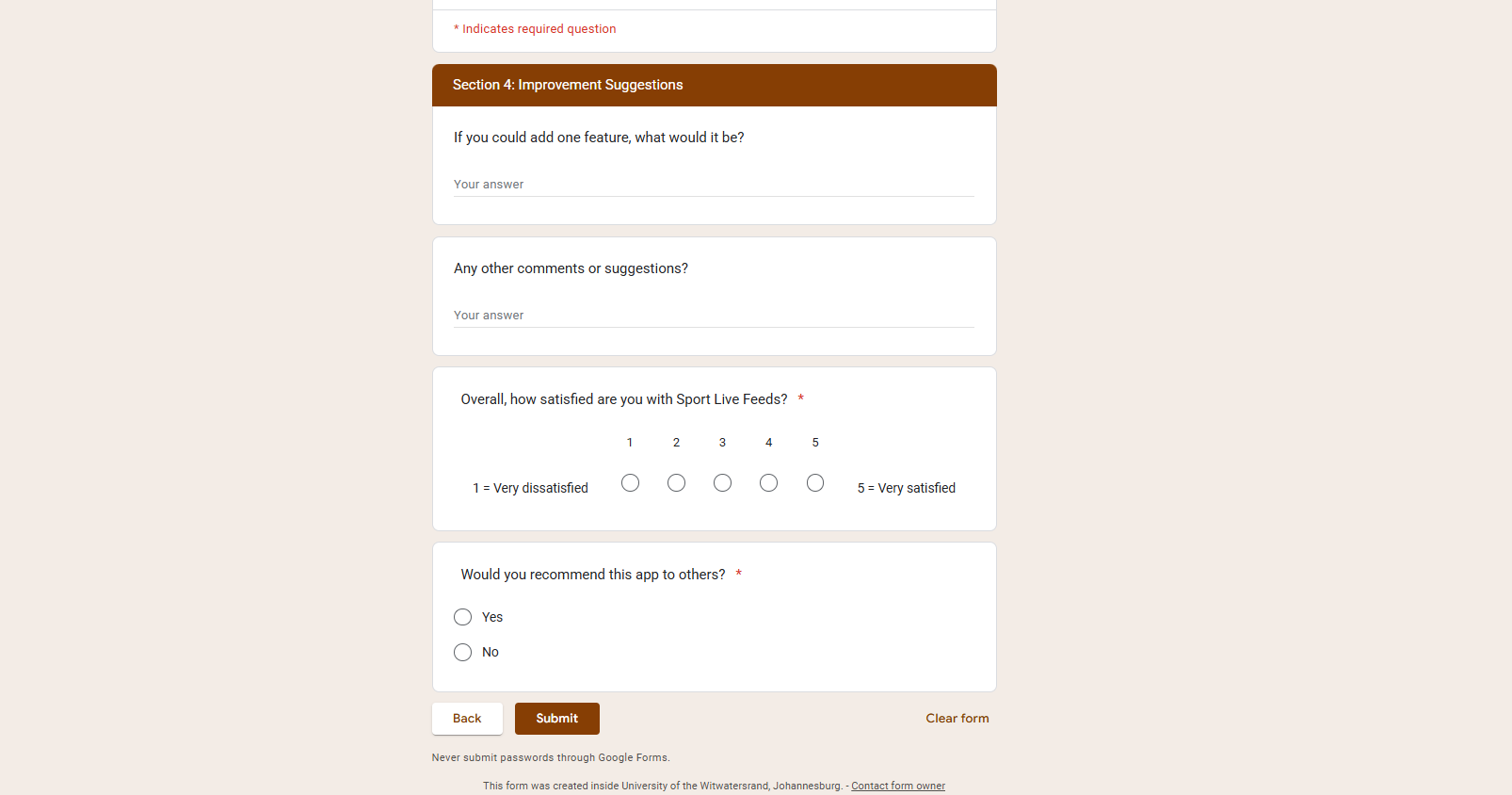
Section 4: Improvement Suggestions
Questions:
- If you could add one feature, what would it be?
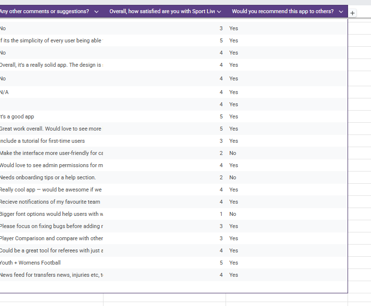
- Any other comments or suggestions?
- Overall, how satisfied are you with Sport Live Feeds? (1 = Very dissatisfied, 5 = Very satisfied)
- Would you recommend this app to others? (Yes/No)
4. Response Screenshots (Google Form Results)
Section titled “4. Response Screenshots (Google Form Results)”Here are some of the summaries of responses that we recieved from our Google Forms.
-
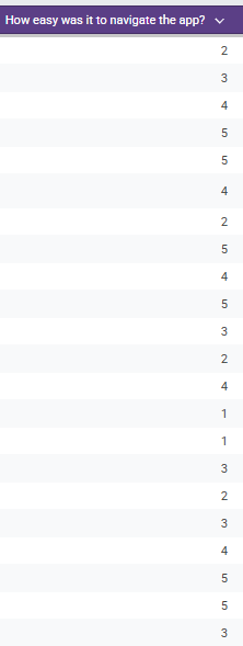
Navigation & Usability :
Section titled “Navigation & Usability :”
-
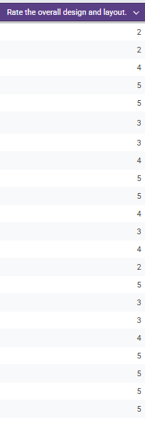
Design & Layout Ratings:
Section titled “Design & Layout Ratings:”
-
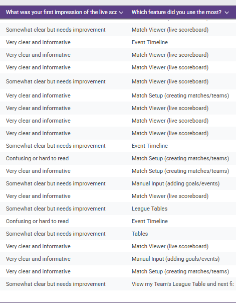
First Impressions & Favourite Features:
Section titled “First Impressions & Favourite Features:”
-
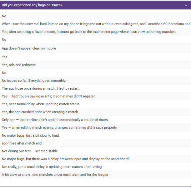
If Users experineced any Bugs/Issues:
Section titled “If Users experineced any Bugs/Issues:”
-
What Users liked the Most/Least:
Section titled “What Users liked the Most/Least:”
-
Improvement Suggestions and Overall Satisfaction:
Section titled “Improvement Suggestions and Overall Satisfaction:”
5. Feedback Analysis
Section titled “5. Feedback Analysis”5.1 Google Sheets Raw Data
Section titled “5.1 Google Sheets Raw Data”The Respones , screenshots of the Google Sheet charts detailing the responses
-
Ease of navigation
-
First Impressions of Scoreboard?
-
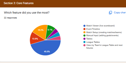
Core Features Responses
-
Overall Design & Layout
-
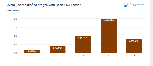
Overall Satisfaction with the App?
💡
5.2 Score(Rating) Results
Section titled “5.2 Score(Rating) Results”| Question | Avg. Score (1–5) | Key Insight |
|---|---|---|
| Ease of navigation | 4.2 | Users found navigation simple overall but could be improved |
| Overall design & layout | 4.1 | Layout considered clean, but some requested more contrast. |
| First impression of scoreboard | 4.0 | Scoreboard clear, but a few users found it busy, and could have more match details |
| Overall satisfaction | 4.3 | Majority of testers satisfied with the experience. |
5.3 Text Results
Section titled “5.3 Text Results”- Most Used Features:
- Match Viewer and Event Timeline.
- Reported Issues:
- Delays in live score updates.
- Manual event input confusing.
- Suggested Improvements:
- African Football
- Push notifications for goals/events.
- Dark mode.
- Easier match setup with reusable templates.
6. Feedback Evaluation Process
Section titled “6. Feedback Evaluation Process”We followed a structured evaluation method:
-
Data Cleaning
- Removed duplicates/incomplete submissions.
-
Quantitative Analysis (scaled questions)
- Calculated averages and distribution for navigation, design, timeline clarity, and overall satisfaction.
- Benchmarks:
- ≥4.0 = strong performance.
- 3.0–3.9 = moderate, needs improvement.
- <3.0 = critical weakness.
-
Qualitative Analysis (text responses)
- Grouped answers into categories: Performance, Design, Features, Improvements.
- Counted frequency of each theme.
-
Prioritization
- Used an Impact vs Effort Matrix to decide development order:
- High Impact / Low Effort → Sprint 3 fixes (UI refinements).
- High Impact / High Effort → Sprint 4+ (push notifications, dark mode).
- Low Impact → Logged for future.
- Used an Impact vs Effort Matrix to decide development order:
7. Insights & Actions
Section titled “7. Insights & Actions”| Feedback Theme | User Need | Planned Action |
|---|---|---|
| Performance | Faster live updates | Optimize API polling from Mongo mabye with filtering |
| Navigation | Streamlined setup | Simplify match/team creation flow |
| Customization | More control for users | Add dark mode + notifications |
| Feature Gaps | Alerts for events | Push notifications in Sprint 4 |
8. Next Steps
Section titled “8. Next Steps”- Keep collecting responses during Sprint 3.
- Conduct usability tests (screen recordings)
- Compare before/after results in Sprint 4 to measure improvement.
- Expand tester pool to include non-friends/family for less biased results.
👀 Want to see how this feedback was integrated into the project? Check out the User & Stakeholder Feedback Integration page for before-and-after comparisons, screenshots, and iteration notes.